
Of Kermit and Convicts
OF KERMIT AND CONVICTS
A little while back, government-issued number plates proclaimed this to be Your Natural State. Their words: Your. Natural. State.
This confused those of us who use the English language on a regular basis, because the term ‘your natural state’ means nude. Bare-skinned. As we came into this world.
Naked.
The number plates also confused the hell out of visitors who came here and expected to see unclothed people roaming the countryside. Most have gone back to Queensland, thankfully.
Common-sense communication is something at which governments are piss-poor. It’s most evident out there in the wide world, where, just once in a while, the unobserved handiwork of public servants actually goes public.
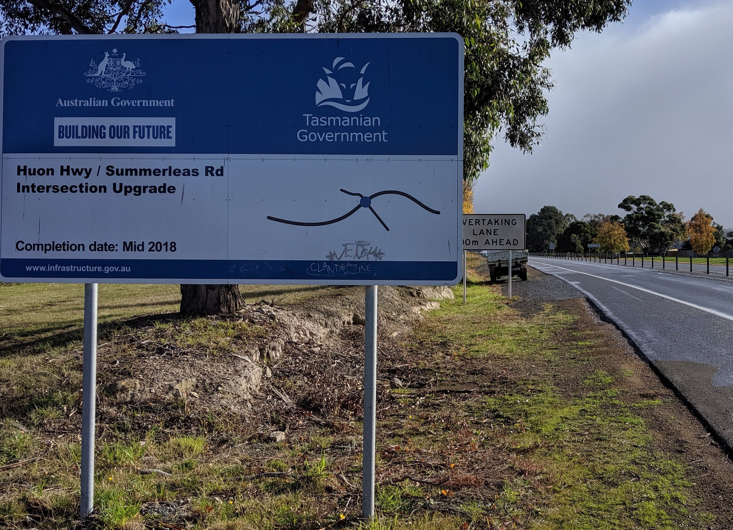
Currently, there’s a stroke of their informational genius on a highway just south of Hobart, our esteemed capital. This is a sign that proclaims that bit of tarmac Roads for Our Future.
Let me repeat that. Roads for Our Future.
A driver can only imagine this sign exists to make the necessary distinction from the many roads around the south of Hobart, and close by, that were built by convicts.
These are the guys who pretty much nailed Roads for Our Past.
Let me put it this way. What the hell are roads for, other than for the future?
Were there other options? Something about bringing communities together, perhaps? The Way Forward would be better. I’m asking: Who came up with the wording for this sign? What committee – and you just know it was a committee – came up with this generic waffle?
As Kermit says in Muppet Treasure Island, his mounting despair matching his froggie pitch: “Who hired this crew???”
I know, I know. You just put this stuff behind you, figuratively and literally, and drive on. Don’t dwell on it because, frankly, you have limited capacity to harbour all the stupid.
But this is something that’s getting on my last nerve.
You can argue it’s not really my business, and it’s true that the design of road signs is not my business. But I am a road user and this road sign is directed at me. So call me a consumer of road signs.
Here’s another, in this photograph and in all its glory, a sampling of the quarter-baked thinking that got through some roadworks committee or other.
Let’s put aside the fact that these roadworks were completed two years ago and the sign no longer serves a purpose. That’s the least of its failings.
Let’s put aside the fact some tagger has tried to improve its appearance. Who could blame them?
The sign itself is a by-the-numbers job. See how it divides the real estate into four, one quarter to credit one government, one for the other, a third for a stab at a project title.
And then there’s the graphical representation of that very highway project, the part where my eye has settled, where my ire has become unsettled.
You’d be forgiven for thinking this depiction of a major highway, a $20 million piece of infrastructure, is the work of an eight-year-old who lost interest partway through her first attempt at macramé.
As a piece of graphic design, it’s what in the business is called ‘lazy.’ In any business, actually. It’s dumb. Inadequate. Piss-poor.
Here’s the problem, spelled out so, say, an eight-year-old can comprehend.
The fatter line, which we assume is the highway, is running perpendicular – left-to-right – from the driver’s perspective.
For a driver, a highway does not run left to right, unless you’ve done something really stupid. It is ahead of you, in the same direction as your nose, not across your vision.
And to be clear, you have to be a driver to see this sign; it’s just there, to your left, on the shoulder of the very highway you are driving on.
So the sign is oriented in relation to the highway, and the graphical representation of that highway needs to be oriented in relation to both sign and highway.
Are you with me so far?
The highway should be shown as running from the bottom of the sign, and heading up, so it faces the same way as the car. Or truck. That way, the sign would say: you are here, driver, beside this very sign, at the start of this bit of highway. Go ahead!
The sign could say more, a lot more, such as the fact the highway ahead provides multiple lanes, while Summerleas Road, where it intersects, is only one in each direction. One of those directions is Kingston, and the other Fern Tree.
Wow! So much information!
That would provide visual clarity to the driver – simple, quick and purposeful communication.
And that, people, is what road signs are for.
